3 UX designers, 4 companies, 2 month, we shipped the demo before Christmas. I created a couple quick concepts, get approved with the directors, then worked with all the partners to make the prototype and technology coming together.


We got all the attention wanted, first time as a company. And won a couple awards. It's really interesting to see the competitors drooling over it and trying to look at every detail.


We still have little idea what this device is all about. In the CES demo, we had smart cooking(since it's right at where you cook) and IOT control (since it's a big monitor) We did hear a lot of feedback from CES visitors. What else could this device help user better?
In the past we had built many kitchen concepts, they went to many shows and gathered quite a lot feedback. Many feature ideas actually came from these ideas. It's worth noting the floor to ceiling concept is having 2 cameras, 1 facing forward, and 1 facing down.
There was many fridges as our direct competitor in the kitchen, as well as new smart displays as a new category. All the devices are investigated thoroughly for feature sets and design.


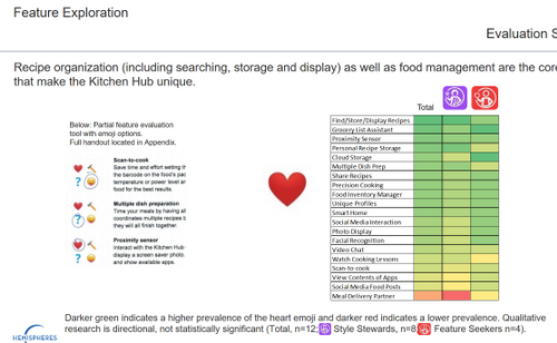
Kitchen is a extremely dynamic space, potentially the heart of the home. All kind of activities happen here, as well as all the appliances and smart home gadgets. So we built this LEGO home with all people and devices, brainstorming the features, or connections. Feature list and user journeys are created, then went to homes for research.

Since there is a camera facing downward, what else it could help users? During earlier research, many families has a collection of recipes, especially passed down from family. What if we can digitize them, to make them searchable and easier to access. Technology team jumped right into OCR, but I think the hand writing is what make these recipes treasure of the family.

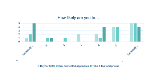
These ideas,went through internal and external research, not surprisingly, user love the idea of digitizing their own recipes.


Click Elmo to see how I communicated and convinced other teams. We also built a rig to find the sweet spot and finding the optimal height.
Lorem ipsum dolor sit amet, consectetur adipiscing elit. Suspendisse varius enim in eros elementum tristique. Duis cursus, mi quis viverra ornare, eros dolor interdum nulla, ut commodo diam libero vitae erat. Aenean faucibus nibh et justo cursus id rutrum lorem imperdiet. Nunc ut sem vitae risus tristique posuere.
The kitchen hub it's first of its own kind. There are many unknowns. Before things settle down, we started devise from different ends. The first thing is the ergonomics, since it is a touch screen built above the range, would the height work for everyone? What are the impact on the UI design?

We built an initial prototype with above consideration and demoed to leadership, partners and clients for feedback. But this is not the real use case, yet.
To verify that this device won't create fatigue in actually cooking experience, I built a intensive functional prototype in Unity, invite target users to actually finish a 30 minute cooking session.
Promising result, no evidence suggesting the location can create fatigue. By the paper, the 10% female should suffer fatigue in 7 minutes, but since the interactions are intermittent and cooking is active, no participant complained about it. There was also no complains for the primary interaction area.


We know in the beginning that we won't invent our own OS. Android as an open source platform is the obvious choice. There was early debate on Android OS, vs Android TV OS and the young Android Things platform. Our device also needs to be GMS certified, thus to follow Google's requirements. In the smart home app, we included Amazon Virtual Dash Buttons with their complete functionality. The recipe app partner we picked is SideChef, we used their technology and content. The customized OS and smart home app is developed by Haier U Home team.
Lorem ipsum dolor sit amet, consectetur adipiscing elit. Suspendisse varius enim in eros elementum tristique. Duis cursus, mi quis viverra ornare, eros dolor interdum nulla, ut commodo diam libero vitae erat. Aenean faucibus nibh et justo cursus id rutrum lorem imperdiet. Nunc ut sem vitae risus tristique posuere.


We know in the beginning that we won't invent our own OS. Android as an open source platform is the obvious choice. There was early debate on Android OS, vs Android TV OS and the young Android Things platform. Our device also needs to be GMS certified, thus to follow Google's requirements. In the smart home app, we included Amazon Virtual Dash Buttons with their complete functionality. The recipe app partner we picked is SideChef, we used their technology and content. The customized OS and smart home app is developed by Haier U Home team.


fun glitch video
We know in the beginning that we won't invent our own OS. Android as an open source platform is the obvious choice. There was early debate on Android OS, vs Android TV OS and the young Android Things platform. Our device also needs to be GMS certified, thus to follow Google's requirements. In the smart home app, we included Amazon Virtual Dash Buttons with their complete functionality. The recipe app partner we picked is SideChef, we used their technology and content. The customized OS and smart home app is developed by Haier U Home team.
microwave

Start war
context
think about future
If you like what you see and want to work together, get in touch!
ChenLuxDesign@gmail.com